Experiments with Machine Learning & Lex: Teaching a Machine to Identify Color

Amazon has (somewhat) recently added some new services under the Artificial Intelligence offerings, one of them being a Machine Learning service. I wanted to play around with their predictive analysis service so I decided to make a really simple proof of concept.

Predictive analysis, in a nutshell, is basically looking through a large dataset of various input values that each contain an outcome. That outcome may be a true or false conditional (Binary Classification), a numerical value (Regression), or identifying a label (Multiclass Classification). This data is used to generate a model that makes a correlation between the input variables and the outcome, which can then be fed new input values to predict what the outcome will be. The catch, of course, is that you need to have this large set of training data to work with.

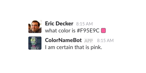
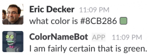
Since I didn’t have any data available, I wanted to see what I could possibly generate on my own. I decided on trying to make a model that could guess the name of a color based on the input value. The end result would look something like the following (once integrated into slack):

Continue reading “Experiments with Machine Learning & Lex: Teaching a Machine to Identify Color”

Doing Stupid Things with Google Spreadsheets

pixcell-thumbnail

I use Google Spreadsheets pretty often at work, but for more mundane  typical scenarios such as budgets, time and scope estimates, and so on. However, as I played with formulas and some of the built-in features, I was curious to what other non-productive things I could create. This lead me to a project I recently completed that uses the spreadsheet grid to recreate images. This was recently featured in the 2nd annual Firstborn Art Show (All These Things 2016) under the title Pixcell Images.

You can check out the entry here: Pixcell Images by Eric Decker.  There are about 20 images that rotate every 15 seconds.
There’s also a version that accepts and shows user-submitted images via MMS, which you can text to at 585-672-6394  (try it out while it’s still active!)

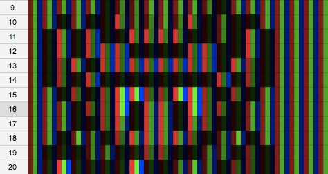
The concept is pretty simple — I display small images (up to 32 x 32) in a spreadsheet by coloring three cells for each pixel’s red, green, and blue value. Basically, more or less how a typical monitor or screen works. A separate external script processes the images and sends the data to the Google Spreadsheet, but the spreadsheet processes and displays the “image” all on it’s own without any additional scripting.

Pixcell: Mario Kart Toad
Toad sprite from the original Mario Kart displayed in a Google Spreadsheet.

It was a fun process, so here are some of the interesting steps it took to achieve the final results.

Continue reading “Doing Stupid Things with Google Spreadsheets”

CATScan: It Doesn’t Hurt to Twitter Up Close and Personal.

Just a quick note that I will be  regularly contributing to Creativity Online’s CATScan blog. It’s a collection of post from various people about digital media and advertising. I’ll be posting one article per month along with Dave Snyder, who is one of the Creative Directors at Firstborn. My first article is titled ‘It Doesn’t Hurt to Twitter Up Close and Personal’ and is about how businesses can use twitter to intimately reach their audience. My first article is linked here: It Doesn’t Hurt to Twitter Up Close and Personal.

Speaking at OFFF Paris 2010

offf-paris-2010-firstborn-header

I probably should have mentioned this way earlier, but I’ll be speaking along with Mathieu Badimon at OFFF Paris on behalf of Firstborn. Our presentation will be on Friday, June 25th at 12:30. I have to say, this is quite an honor to speak at this conference. If you’re interested, there should be more information on the OFFF Paris 2010 website.

Speaking at FITC Toronto 2010

So I realize this is pretty last minute, but I’ll be speaking at FITC Toronto this Monday with Mathieu Badimon. We’ll be speaking on Firstborn’s behalf. Our presentation is titled “Tools & Prototypes: Crafting a Unique Digital Experience.” It’s basically focusing on how for each project we make, we usually need to make demos to test techniques or make tools to aid in development. It’s more of a creative presentation than a technical one, as we really won’t be talking about code directly. So if you’re up at FITC this weekend, we’ll be presenting Monday at 12:10.

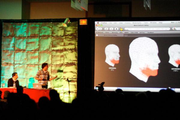
fitc-2010-presenting Continue reading “Speaking at FITC Toronto 2010”

AirTran: EveryFlight.com

airtran_banner

I’m a little behind here, but here is my latest project from Firstborn: AirTran EveryFlight.com, where I was the front-end developer for the project. We worked with Cramer-Krasselt in order to bring this site to life.  AirTran is a small domestic airliner, and they wanted to run a promotion to see what people wanted on every flight.  So we built a site to collect ideas, then let people vote on them and see how each one ranked on a state and national  level. The site only ran live for about 4 weeks until the winner was announced which happened to be Wi-Fi. You can see the old phase 1 site persevered here on Firstborn’s portfolio. It was a really cool project to work on, especially once it launched to see the suggestions come piling in. Our back end developer for the project, Wes Grubbs, built the database and admin tools, and we used AMF php, which provided to be really simple and easy to use.  And as always, I also got to do some nifty features on the site.

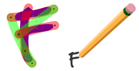
So the first challenge was that we wanted the user to be able to write in their suggestion on one of the cards and actually have a pencil do the writing. There were two important parts to this process. The first is getting each letter traced out. The basic methodology behind this is that we will create for each letter a set of points on a path (anchors and control points for curves) and then use that path to mask out the actual letter. By drawing that path over time, we can create the illusion of the letter being drawn in as it is being reveled. The second part is having a pencil follow the letter, which is simple since everything is done by numbers and the drawing API, so from the current path being drawn we can grab the ‘end’ of it and just have an object track that point, thus having it follow the path being drawn in and the illusion that the pencil is drawing the letter. To create the pencil, I used FIVe3D.  Mathieu had created a pencil for the M&M’s Join the Hunt site, so to avoid having it look too similar I didn’t bother using his model/code for reference, I just built out my own (plus it’s more fun that way).
pencil

In order to get the paths for each letter, I created a tracing tool. The tool allowed me to add points and make a path, as well as play with the curves and thickness of the line. Additionally, I added the feature that would allow the pencil to be “picked up” over certain points, meaning it wouldn’t be drawing for that segment (shift+click an anchor point). That is important for drawing letters that have different individual strokes, such as F, where when the pencil was moving I wouldn’t want to unmask a section of that letter as the pencil crossed it to get to another location. Once each letter is traced, it can be saved out as XML which is imported to the site and parsed into usable information.

See the letter tracing demo
See the letter writting demo

Another thing that was kind of interesting, although at this time I don’t have a demo for, was creating the rollover for the stack information. One of our newly hired 3D/Motion Designers, Brett Swanson, first modeled the stack to resemble the initial comps our designer Verena did. In order to make the cross-section, I first made a black and white image of the stack. The black being one side of the paper, and white being the other. Where the two colors met is the corner. So in Flash when the user rolls over the sack, I look across the horizontal strip of pixels from that mouse point and look for the area where white meets black, and I know that’s the corner. I can then do some masking, then calculate the rest of the points around it to create the cross-section plane, which is not 3D in anyway. As for the animation of the card being pulled out, Brett created a static animation that we imported as a PNG sequence, then position it to where the mouse click is, and scale it accordingly to be the correct size. Due to perspective, it doesn’t always match up. But since it is such a quick animation, we can fake the perspective by just slightly rotating the animation a little so that looks like the perspective matches up. As the animation plays, it rotates back to zero and scales back to the default size, and then is swapped out with the flipping animation which is dynamically done in five3D. As I always say, it’s all smoke and mirrors.

map

(images after the jump)

Continue reading “AirTran: EveryFlight.com”
FITC Toronto 2009 Presentation

FITC Toronto 2009 Banner

It gives me great honor to announce that this year I will be giving a presentation at FITC Toronto alongside Firstborn coworker Jens Fischer. I’ve attended FITC for the last three years, and each time I’ve always enjoyed it. Shawn Pucknell has always puts together a great program with the best of the best of the Flash and web community. I have always found great ammount of inspiration from FITC, I always leave feeling creativtily renewed, so I really hope that this year I can be amoung one of the presentors that inspires others.

Our presentation is about the blending of 3D with web to create an engaging experience. We’ll talk about the techniques we have used in recent projects at Firstborn (such as Puma Lift, which launched on this past Friday), as well as technologies and techniques that we’ve just played around with. Here’s the writ-up as it is found on the FITC website:

Dimension Wars. Bridging the Gap Between 2D and 3D in Flash

The focus of this presentation will be the techniques used in creating 3D experience in Flash. We’ll look at different means of accomplishing this; whether it is creating a fully 3D environment right in Flash, combining pre-rendered sequences within a 3D environment, or even faking the 3D completely. We’ll be showing techniques that we have used in projects such as Sport Chalet: The Mountain, M&M’s Join the Hunt, Puma and XM Wild Ride. In addition to these, we’ll also be showing behind the scenes prototypes and demos, as well as internal experiments from our Firstborn Experiment Lab.

We will cover techniques from projects that use alternative means of creating 3D objects (how we created the mountain for the Sport Chalet site, first as based off of noise, then later from a VRML file), compositing rendered stills into a 3D-like environment (M&M’s), displaying 3D assets in a non-3D environment and adding 3D as a detail or interactive component in the Flash experience.

It’s not too late to buy tickets and attend. For more information about tickets, travel, etc, check out the FITC website.

Bitmap Filter Adventures

I ran across two little bitmap related issues in Flash during my last project (should be live by end or March) that I’d thought I share.

The first issue is regarding layers of transparency. Sometimes in a sprite I’ll have multiple shapes layered on top of each other, or various layers of shapes drawn. Now if you change the alpha of that sprite, it will affect all the objects it contains. So, for example, if in my sprite I have one sprite with contains a red rectangle, and on top of it there is another sprite with a blue circle, if I change the alpha of the container sprite, you’ll be able to see though the blue circle since it’s alpha is also being changed. If I want the whole thing to fade together, so I don’t see though the individual parts, I’m out of luck.

So I figured I could use cacheAsBitmap to essentially flatten the sprite, so when the alpha is applied it would be applying it to an image. However, this doesn’t work. Obviously, I could just do it manually and draw the contents to bitmapdata, and swap it out whenever I need to do a fade. I’d like to avoid that as much as possible, so I figured I would try a last ditch attempt – using a empty filter. Basically, if I put a blur filter (or any other) on the container sprite that I am applying the alpha change it, Flash will automatically cache it as a bitmap. Logically, this should be no different than just setting the cacheAsBitmap property to true, as I had done before and failed. However, this works. I don’t know why, but somehow setting a filter to the sprite forces it to cache differently then just using the property. Below is an example (The bars at the top are to show a side to side comparison of each color for each object. It shows that the alpha affects the colors the same way for all of them, since it appears as an optical illusion that the one on the right is different)

[flash http://testing.eric-decker.com/layercache/layer_alpha.swf w=550 h=400]

The other thing I’ve run into before, and I’m sure countless others have to, is applying a filter to an object which you have drawn something round in. What happens is that the right-most one or two pixels of the image get cut off.  It looks like Flash is converting the object to a bitmap (which we know it does), but is not taking anti-aliasing into account when setting up the bitmapdata width and height. The solution I used to get arround this issue is when drawing my shape I add a 2px transparent line around it. You won’t see the line, and since it’s a stroke it shouldn’t affect the active mouse area if the target is a button. If you’re drawing a shape  that already has a stroke around it, you’ll either need to draw it twice or do something to give the are just that little extra bit of padding on the edges. Here’s an image to help illustrate what I’m rambeling on about:

bitmap_circle_filter_bug.jpg

Esquire E-Ink

For their 75th anniversary, Esquire printed 100,000 special editions of their October 2008 issue with ‘e-ink.’ Basically, the added a video screen into the cover of the magazine. When I first heard about this, I was immediately intrigue. I searched NYC for a copy, and didn’t find one until a friend told me he saw some in Grand Central. The quality of the screen was better than I expected, however, the term e-ink is a little misleading. I thought from the sound of it that it would be very thin and flexible with a small circuit board. The cover is rather thick, not very bendable, and the circuit board is pretty evident. The screen is also only black and white, with a color transparency overlay. So this isn’t like e-paper or any of the concepts of inexpensive paper-thin and flexible screens, but it’s a step in that direction. It’ll be interesting to see what develops next, if anything at all.